


House Bayou
Website for a family-owned Cajun restaurant

BACKGROUND
I worked as a UI/UX intern under re:Bloom, a digital agency aimed at helping minority-owned, women-owned small businesses enhance their online presence.
Along with a project manager and another intern, we developed a website for Finleyville, PA’s House Bayou restaurant to address our client’s need for a space to communicate with customers, enhance her brand identity, and consolidate her assets.
MY ROLE
I spearheaded the design process, participating in conversations with our client to understand business needs, customer pain points, and brand identity. I mocked up lo-fi/mid-fi wireframes and implemented the design using Squarespace's design system. I conducted usability testing and received feedback from other designers. I incorporated Google Analytics, SEO, and ADA accessibility requirements.

Timeline
Summer 2022
Team
Rachel Liu
Irene Hong
Deliverables
Responsive website
Style guide
Site documentation
Training videos
Google business profile
Tools
Figma
Squarespace
SEO
Google Analytics
RESEARCH
The first week, we took some time getting to understand industry standards, target users, and potential platforms for her to host her website on.
Industry Standards
We first performed a competitive analysis of competing restaurants that were similar to her own, namely local restaurants and Cajun restaurants.
We found that small local ones were focused similarly on being comfy, casual, and warm, while Cajun seafood restaurants like Hook and Real were cartoonish, bright, and fun. There were common features across all sites, such as an eye-catching landing page, catchy mission statements, and About Us information.
Customer Discovery
We performed customer discovery research, defining our client’s potential customers and what they might want from a website of hers.
We synthesized our findings to our client, recommending that she incorporate the common features we noticed, along with some keywords that we felt described her restaurant: comforting, charming, modern.
We also dug into possible website building platforms she might want to use — since she would be paying for a Business plan and using the platform extensively once we were finished, it was important that she was fully on board with it.
Ultimately, we all agreed that Squarespace was the best option, since it provided both important business functionality and design customizability.
EARLY DESIGN
To kick off the design process, I created a mood board featuring colors, fonts, and images that we thought might best represent House Bayou.
It was heavily New Orleans inspired, paying homage to our client’s place of birth and the Cajun influence on her food. The outdoor seating pictures, with all its greenery, depicted the homey atmosphere she wanted to portray, while the typography set against off-white injected some modernity.
My mood board resonated deeply with our client, allowing us to move forward with creating low-fidelity wireframes for the pages of her website: Home, Menu, Updates, Gallery, and About Us.
We stuck to a more organized approach for the Menu, Updates, and Gallery pages, while the Home page was more diverse in its content. We were aware that it would be the first thing users saw — and thus it was important to make it as captivating as possible. Similarly, for the About Us page, we wanted to showcase a different, more personal side to the restaurant, with a large photo of our client’s family.
Once the wireframes had been reviewed and approved by our client, we chose to start working on the website itself rather than moving to high fidelity wireframes.
The short duration of our time together along with the fact that Squarespace was unfamiliar to us, made it more important to start prototyping a functional website early on.
Moreover, our client’s physical restaurant was also still in the works, and as a working parent, she had many details she had yet to work out. We didn’t want to be limited by a set design when there were likely to be major changes happening. In our situation, flexibility was key.
PROTOTYPING
For our first version of the site, we went with the color scheme we had used for our mood board and used our mid-fi wireframes as a starting point. Working directly with Squarespace gave us a better gauge of its capabilities and user experience, enabling us to make changes as we went along. We implemented the mobile version as well as the desktop version to ensure that the website could be accessed and experienced on all different devices.

USER TESTING
We conducted usability testing sessions with potential users of our client’s website, leading them through different scenarios and asking them for feedback on the navigability of our prototype site. We also participated in a feedback roundtable session with other re:Bloom teams, allowing us to get a sneak peek on what others were working on and have fresh, design-minded eyes on our sites.
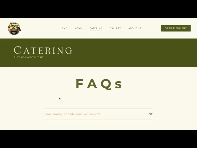
The catering form, although convenient for customers, lacked enough information to be able to help them decide whether they wanted to order catering from House Bayou
The description of the menu items felt inconsistent, with some dishes having a list of ingredients and others not having any;
Although the location of the hours on the home page was visually pleasing, its placement wasn’t intuitive for users;
The contact information was difficult to find, with many of our users heading to About Us rather than scrolling down to the footer;
Our menu form had a lower contrast of color, which could affect its accessibility;
The gallery felt crowded, risking that we overwhelm customers and induce choice paralysis;
The Updates page for specials seemed unnecessary, since customers likely wouldn’t be concerned about past specials.
FINAL DESIGN
Key changes
DOCUMENTATION
Part of our mission in re:Bloom was having a sustainable design. We wanted to set up our client for success so that they’d feel prepared to maintain their website without us.
Throughout the summer, we performed live demonstrations of Squarespace during client meetings, instructing her how to manipulate the design of elements and add different elements. We also worked with her on setting up a Google business profile, and combed through an SEO and ADA checklist to ensure her website met all the requirements.
We also recorded training videos that walked our client through all the main features of Squarespace. We put them all in a folder that she would have access to after our cohort was over. Training videos were paired with weekly training tasks, which gave our client a chance to tinker with Squarespace on her own.
Lastly, we wrote a style guide containing all the colors and fonts we used for the site. My partner and I also created a How-To-Guide, which covered general design questions, page-specific questions, important reminders on SEO / ADA upkeep, and helpful resources for when she wanted to set up an online ordering service.
RESULTS
After ten weeks, we handed off full control of the website and the rest of our deliverables to our client! Parts with missing content were clearly defined for our client so she could update them when she was ready
Before
After
REFLECTION
Takeaways

Moving Forward


If I had more time with our client, I would then focus on the site’s SEO and business analytics. Collecting enough data to measure the success of a product takes time, so I was only able to get our client started with SEO and business analytics, as well as make sure her website was in the best shape possible to be crawled by search engines. I would have liked to explore post-development work more.
Since our client was not well-versed in front-end development, we were only able to use minimal amounts of CSS to ensure that our client could manage the website once we were done. However, with a longer period of time I would have liked to use the custom code feature of Squarespace to be more creative with the website’s design and experiment with different effects.
Contact me
phyllis.feng2003@gmail.com
Work
Other projects
About